Build Your Social Media Analytics Dashboard


It's time to get out of the spreadsheet maze. Forget drowning in confusing data and generic reports. A real social media analytics dashboard is your mission control, pulling all the crucial performance numbers from your channels into one place. It’s the only way to see what's actually working at a glance.
Why Your Business Needs a Custom Dashboard
Let's be honest, flying blind on social media just isn't an option anymore. Social trends can make or break a product launch, and they heavily influence how people buy. A generic, one-size-fits-all report can't capture the unique story of your brand's efforts. That’s why a custom dashboard isn't just a nice extra—it’s a core part of your strategy.
This is the tool that separates brands that are just collecting data from those that are using it to make genuinely smarter decisions.
Think of it as the central nervous system for your entire social media strategy. It connects every single action—every post, every ad, every comment reply—back to a real business result. Without that central view, you're just guessing. Did that viral video actually move the needle on sales, or was it just a momentary blip of attention? A well-built dashboard gives you the real answer.
Moving Beyond Surface-Level Data
The true strength of a custom dashboard is how it turns raw numbers into a story you can actually understand and act on. I’ve seen time and again that the best marketers build dashboards that don't just report metrics; they reveal deep insights.
Here’s what that really means for your business:
- Justifying Your Budget: You can finally draw a straight line from your social media spending to conversions and ROI. This allows you to confidently show company leaders how your team's work directly impacts the bottom line.
- Making Strategic Moves: A good dashboard immediately shows you which content formats your audience loves, which platforms send the most valuable traffic, and where people are genuinely engaging with your brand.
- Understanding Real Performance: It forces you to look past vanity metrics like likes and follower counts. Instead, you can focus on what actually drives growth, like lead generation, cost per acquisition, and customer lifetime value.
The connection between social platforms and the marketplace is only getting stronger. As we move through 2024 and look toward 2025, analytics dashboards are absolutely critical for measuring marketing effectiveness. This is especially true with the explosion of social commerce.
Consider this: in the U.S. alone, social commerce sales are expected to blow past $90 billion in 2025. That's a huge leap from $64.8 billion back in 2023. This kind of growth creates an urgent need for tools that can track consumer behavior and prove campaign success. If you want to dig deeper into these numbers, Sprout Social’s social media statistics are a great resource.
A great dashboard doesn't just show you what happened. It helps you understand why it happened and what you should do next. It turns reactive reporting into a proactive strategy.
Ultimately, building a custom dashboard is about taking back control. It empowers you to stop feeling overwhelmed by endless data streams and start steering your social media presence with purpose and clarity, proving your value every step of the way.
Choosing Metrics That Actually Matter
A social media analytics dashboard is only as powerful as the data you feed it. Let's be honest: if you're only tracking vanity metrics like follower counts or total impressions, you’re just building a report card for your ego. The real trick is to pick metrics that tie directly back to your actual business goals.
Your dashboard needs to tell a story—a story about what’s driving real results. So before you even think about adding a chart, stop and ask yourself: what does success actually look like for this business? The answer is going to be wildly different for everyone.
An e-commerce brand, for example, will live and die by its conversion rates from social ads and its return on ad spend (ROAS). But a B2B company? They’re probably more interested in the quality of leads coming from their LinkedIn campaigns or their share of voice in a specific industry niche.
A dashboard full of metrics without context is just noise. A dashboard that connects social activity to business outcomes is an engine for growth. Stop tracking everything and start tracking what matters.
Organizing Metrics for a Coherent Story
To make your dashboard useful, you need to be able to understand it at a glance. The best way I’ve found to do this is to group metrics into categories that follow the natural customer journey. This simple framework prevents information overload and helps anyone, from your team to your boss, see the whole picture. A classic, effective approach is to break it down into Awareness, Engagement, and Conversion.
- Awareness Metrics: This is all about how many eyeballs are on your brand. Think Reach and Brand Mentions.
- Engagement Metrics: This shows you how people are actually interacting with what you post. Key metrics here are Likes, Comments, Shares, and the often-overlooked Saves.
- Conversion Metrics: Now we're talking about the bottom line. This is where you track things like Click-Through Rate (CTR), Website Clicks, Leads Generated, or Social Commerce Sales.
When you segment your data this way, you can quickly spot where your strategy is working and where it’s falling flat. For instance, if you have high awareness but crickets on the engagement front, it's a huge red flag that your content isn't hitting the mark, even if lots of people are seeing it. If you want to dig deeper into this, check out these essential social media engagement metrics that reveal what your audience truly cares about.
Selecting Primary and Secondary KPIs
To keep your dashboard from becoming a cluttered mess, you have to be ruthless. The goal isn’t to display every data point under the sun; it's to shine a spotlight on the most critical ones. A fantastic way to achieve this is by designating primary and secondary Key Performance Indicators (KPIs).
Your Primary KPIs are the 3-5 most important metrics—the ones that directly tie to your main business objectives. These are the numbers the CEO or key stakeholders will ask about. If you're an agency running a client campaign, a top primary KPI might be Cost Per Acquisition (CPA).
Your Secondary KPIs are the supporting cast. They help you understand why your primary KPIs are trending up or down. Sticking with our CPA example, some crucial secondary KPIs would be:
- Ad Frequency: Are you burning out your audience by showing them the same ad too often, driving up your costs?
- CTR on Ads: Is the creative actually good enough to make people want to click?
- Landing Page Conversion Rate: What happens after the click? Is your landing page doing its job of turning that traffic into customers?
This focused approach is what turns a social media analytics dashboard from a simple data dump into a strategic command center. It gives you the power to see not just what’s happening, but to quickly figure out why and make smarter decisions on the fly.
Finding the Right Dashboard Platform
Choosing the right platform for your social media analytics dashboard can feel like a huge commitment. In many ways, it is. The market is flooded with options, from all-in-one social media management suites to powerful, specialized data visualization tools. The real goal isn't finding the single "best" tool out there, but finding the one that truly fits your team's workflow, technical comfort level, and business objectives.
The sheer size of this market shows just how vital these tools have become. The global social media analytics market was valued at around $13.83 billion in 2024 and is projected to jump to $17.39 billion by 2025. Experts even predict it will climb to a staggering $51.25 billion by 2029. This massive investment from businesses worldwide underscores why getting this decision right is so critical. You can discover more about this market growth to get a sense of the momentum.
All-in-One Suites vs. Dedicated Visualization Tools
One of the first forks in the road you'll encounter is choosing between an all-in-one suite and a dedicated visualization tool. It's a fundamental choice that shapes what you can do with your data.
All-in-one platforms like Sprout Social or Hootsuite are designed for convenience. They bundle scheduling, community management, and analytics into a single subscription. For teams that want simplicity and a quick setup, these are fantastic because all the data connections are pre-built. You don't need a data analyst to get a functional dashboard up and running in minutes. The trade-off, however, is often a lack of deep customization; you're generally stuck with the metrics and chart styles the platform provides.
On the flip side, you have dedicated visualization tools like Looker Studio or Tableau. Think of these as a blank canvas. They offer incredible flexibility, letting you pull in data from virtually any source—your social media accounts, your CRM, your e-commerce store—and build a completely custom dashboard from the ground up. This is the ideal path for data-driven teams who need to blend social media stats with broader business data for a complete performance picture. The catch? They have a much steeper learning curve and require more technical know-how to get started.
Deciding between these options depends entirely on your team's needs and resources. To help clarify the choice, here's a breakdown of the different tool types you'll find.
Comparing Social Media Analytics Tool Types
A comparison of different types of analytics tools to help you choose the best fit for your business needs.
| Tool Type | Best For | Key Strengths | Potential Drawbacks |
|---|---|---|---|
| All-in-One Suites | Small to mid-sized teams wanting convenience and a unified workflow. | Ease of use, combines multiple social media tasks (scheduling, analytics, etc.), quick setup. | Limited customization, may lack deep or cross-channel data blending. |
| Dedicated Visualization Tools | Data-heavy organizations with analytics expertise needing deep customization. | Unmatched flexibility, can integrate data from any source, creates bespoke reports. | Steep learning curve, requires technical setup, can be more expensive. |
| Native Platform Analytics | Beginners or those needing quick, platform-specific insights (e.g., Meta Business Suite). | Free, accurate for the specific platform, simple interface. | No cross-platform views, very basic metrics, can't be customized. |
| Specialized Listening Tools | Brands focused on reputation management, campaign tracking, and market research. | Powerful sentiment analysis, brand mention tracking, competitor intelligence. | Often focused more on qualitative data than on your own performance metrics. |
Ultimately, there's no right or wrong answer here. Your choice should be guided by your budget, the technical skills of your team, and how deeply you need to integrate social data with your other business intelligence.
A great platform should feel like an extension of your team, not another complicated piece of software you have to wrestle with. Always prioritize tools that offer a free trial so you can get a feel for the user experience and test the integrations before you commit.
This sketch shows what a clean, modern dashboard interface should aim for, emphasizing clarity with just a few core charts.
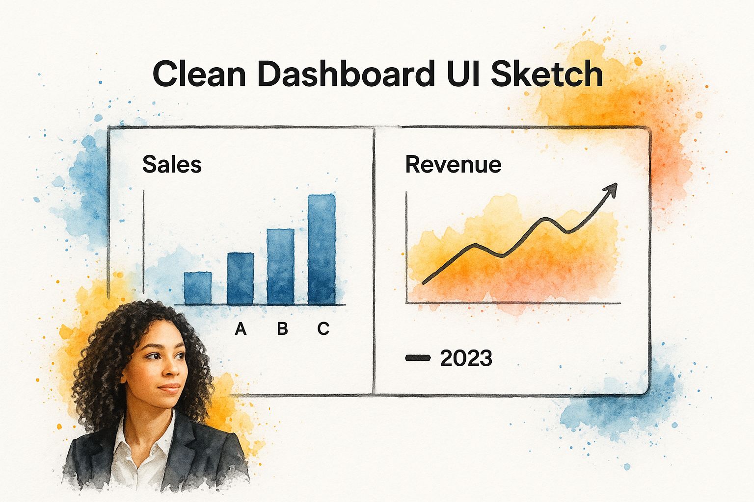
The main lesson from a design like this is that simplicity is power. A successful dashboard tells a clear story with a handful of focused visuals, not a cluttered mess of data points.
Core Factors to Guide Your Choice
As you start evaluating different platforms, cut through the marketing noise and focus on these critical factors. They're what really determine a tool's long-term value.
-
Integration Capabilities: How well does the tool play with the other software you already use? For most businesses, seamless integration with a CRM like HubSpot or Salesforce is non-negotiable for proving social media's impact on the bottom line.
-
Scalability: Will this tool grow with your business? Think about whether it can handle more users, additional social profiles, and a growing volume of data without the price ballooning. You don't want to outgrow your tool in a year.
-
Customization: Can you build the exact reports your stakeholders need to see? Look for flexible widgets, the ability to create custom metrics, and options to design layouts that answer your unique business questions.
-
Transparent Pricing: Be wary of platforms with confusing pricing tiers or hidden fees. A trustworthy provider will be upfront about what's included in each plan, from the number of users to data export limits.
Choosing the right tool always comes down to a balance between power and practicality. By focusing on these core needs, you'll be in a much better position to select a platform that not only gives you insightful data but actually supports your team's day-to-day work and future growth.
Designing a Dashboard for Total Clarity
Let's be honest: a cluttered social media analytics dashboard is often more trouble than it's worth. When data is all over the place, it just creates confusion, burying the important stuff and making it impossible to see what's actually working. The real art of dashboard design isn't about cramming every possible metric onto one screen. It’s about showing the right things in a way that just makes sense.
At the heart of a great dashboard is visual hierarchy. This is a fancy term for a simple idea: guiding your viewer's eye to the most critical information first. It's the same reason newspapers use massive headlines for big news. You want your most important KPIs to jump off the page.
So, how do you do it? Start by placing your big-ticket metrics—things like overall ROAS or Cost Per Acquisition—at the top left. Our eyes naturally go there first. Make them stand out with a larger font or a more prominent chart. These numbers should be impossible to miss.
Matching the Chart to the Data
Choosing the right kind of chart is more than just a style choice; it's essential for telling a clear story. If you pick the wrong visualization, you’re just making your data harder to understand. The goal is to make the data’s story so obvious that anyone can get it at a glance.
Over the years, I've found a few pairings that almost always work:
- Line Graphs for Trends: Want to see how something is performing over time? Nothing beats a line graph. It's the perfect way to track follower growth, engagement rates, or website clicks over a month, quarter, or year.
- Bar Charts for Comparisons: When you need to see how different platforms or campaigns stack up against each other, a simple bar chart is your best friend. It instantly shows which channel is pulling the most weight.
- Pie Charts for Composition: These should be used with caution, but they're great for showing the pieces of a whole. For example, a pie chart is a solid choice to visualize the breakdown of your audience by country.
Take a look at how different charts can represent the same core data.
The format you choose has a direct impact on how easily someone can grasp the narrative, whether you're trying to highlight a trend, compare results, or show how something is divided up.
Using Color and Labels Intelligently
A smart use of color and clear labels is what separates a good dashboard from a truly great one. Don't just pick colors that look pretty; use them to add meaning. Think green for positive movements (like a rising engagement rate) and red for negative ones (like a climbing cost-per-click). It's an intuitive shortcut for the brain.
A well-designed dashboard should tell a story that anyone in the company can understand in a few seconds. It’s not meant to be a data puzzle; it's a clear, concise narrative.
Labels need to be short, sweet, and descriptive. Instead of a vague title like "Engagement," try "Engagement Rate by Platform." This tiny change adds immediate context. These details might seem small, but they add up, transforming your social media analytics dashboard from a source of analysis paralysis into a powerful decision-making tool. This kind of clarity is also a huge part of effective social media community management, because it gets the whole team on the same page about what the audience is doing.
Turning Your Data Into Actionable Insights

A well-built dashboard is a great starting point, but let’s be honest—it’s just a pretty picture until you start asking the right questions. Collecting data is easy. The real work, the part that actually moves the needle, is in the analysis. This is where your social media analytics dashboard stops being a report card and starts being your strategic co-pilot.
Don't just look at a drop in engagement and shrug. Your dashboard should make you dig deeper and ask why. Was it the type of post? Did you publish at a weird time? Could there be a bigger shift in how your audience feels about your industry?
This kind of questioning is what separates passive reporting from active problem-solving. It’s the difference between saying, “Engagement dipped 10% last week,” and realizing, “Our video posts after 5 PM got 30% fewer comments, so we need to rethink our schedule.”
Spotting Trends and Flagging Anomalies
Think of your dashboard as your eyes and ears on the ground. After a while, you'll get a feel for the normal pulse of your social media accounts. This baseline is everything because it makes the unexpected—those sudden spikes or drops—jump right off the screen.
- When things go right: A sudden explosion in shares on a post isn't just a win to celebrate; it's a breadcrumb trail. Follow it. What was it about that post? The topic? The humor? The visual? Figuring that out means you can try to repeat that success on purpose, not by accident.
- When things go wrong: If your website click-throughs suddenly nosedive, that’s a major red flag. Your dashboard should let you quickly see what else changed. Did you tweak your call-to-action? Is a competitor launching a huge campaign and sucking all the air out of the room?
Being able to spot these things in real-time gives you a serious edge. It’s no surprise the social media analytics market is set to skyrocket from USD 10.23 billion in 2024 to an estimated USD 43.25 billion by 2030. Businesses are waking up to the power of these immediate insights. You can read more about these social media analytics market projections to see just how critical this space is becoming.
The goal isn't just to see the data; it's to understand the story the data is telling. Every number on your dashboard is a character in that story.
Connecting Social Activity to Business Outcomes
Here's the bottom line. Your dashboard needs to connect the dots between likes and shares and actual business results. It’s not just about vanity metrics; it’s about proving how your social efforts lead to real leads and sales.
For instance, tracking which social network drives the most webinar sign-ups gives you a clear, direct link to a business goal. If you see LinkedIn is beating every other channel by 50%, you can confidently shift your ad spend and go all-in on what's proven to work. This is the heart of effective social media lead generation—it gives you the hard evidence to back up your strategy and budget requests.
When you start making these connections, your social media analytics dashboard becomes much more than just a marketing tool. It evolves into a core piece of business intelligence, influencing everything from sales tactics to product ideas and proving the tangible value of your work.
Your Top Dashboard Questions, Answered
Once you've built your new social media dashboard, a few questions always seem to pop up. You've got the design down and the metrics plugged in, but making it a truly useful part of your routine takes a little getting used to. Let's walk through some of the common sticking points I see teams run into.
How Often Should I Check My Dashboard?
This is probably the most frequent question I get, and the honest answer is: it depends entirely on what you're trying to achieve. There isn't a single magic number that works for everyone.
For instance, if you're in the middle of a high-stakes product launch or running paid ad campaigns, a daily check-in is non-negotiable. You need to keep a close eye on metrics like ad spend, click-through rates, and initial engagement to spot problems early and make quick pivots. Waiting a week could mean wasting a significant chunk of your budget.
For general content strategy and community growth, a deep-dive weekly review is often the sweet spot. This cadence gives your content enough time to gain traction and reveals meaningful trends, helping you decide what to post next week. Then, zoom out for a comprehensive monthly or quarterly review with stakeholders to connect your social media efforts back to the big-picture business goals.
Can I Actually Build a Dashboard for Free?
Yes, you absolutely can. Many marketers are surprised to find out they can build a surprisingly robust dashboard without touching their software budget.
A fantastic free tool for this is Google Looker Studio. It lets you pull in data from various places, most commonly a simple Google Sheet. The process involves manually exporting your analytics from each social platform and dropping them into the sheet, but from there, Looker Studio can create all the charts and graphs you need.
It's definitely more hands-on than a paid, automated solution, but if you're working with a tight budget, it’s a perfectly viable and powerful way to get started. Don't let a lack of funds stop you from becoming data-informed.
What's the Single Biggest Dashboard Mistake?
I've seen it time and time again: information overload. The temptation to track every possible metric is strong, but it's a trap. It leads to a cluttered, overwhelming dashboard that's impossible to read at a glance. Instead of a tool for smart decisions, it becomes a data graveyard.
The most common mistake is tracking too many metrics. A clean, focused dashboard is always more effective than one that tries to show everything.
Your goal should be clarity, not complexity. Stick to the handful of KPIs that directly reflect your primary business objectives. As a rule of thumb, if your main dashboard view has more than 10-12 core metrics, you’re probably tracking too much. A focused dashboard is an actionable one.
Ready to stop guessing and start growing? GrowChief is your AI engagement agent, working 24/7 to boost your social media presence. Automate interactions, drive conversations, and get real results without the manual grind. Start your free 7-day trial of GrowChief today!

Founder of Postiz, on a mission to increase revenue for ambitious entrepreneurs